

Y2Y Donor Focus Website Redesign
Restructured the Y2Y website's information architecture to reduce friction in the user journey, eliminate content dead ends, and create clearer pathways toward the organization's core call-to-action: donations.


The Problem
-
The original site scattered conservation information, region-specific content, donation pages, and educational resources across disconnected sections. Users had to navigate through 5-7 clicks to reach donation pages, and many got lost in the process.
Metrics that revealed the issue:
Average path to donation page: 7 clicks
64% of users who entered the site never found donation pages
No clear visual hierarchy indicating what content was most important
Users described the site structure as "hard to understand where things are"
The core problem: Users couldn't see the organization's mission and ways to support it reflected in the site structure itself.
Research & Design Process
-
I mapped existing user flows and identified three primary user types:
New visitors seeking to understand Y2Y's mission (35% of traffic)
Supporters looking to donate or learn about specific regions (48% of traffic)
Educators searching for curriculum resources (17% of traffic)
Each group needed different entry points and different paths through the site, but the original structure treated all content equally.
Usability Testing: Navigation & Findability
Testing with 12 users revealed:
Users couldn't distinguish between primary navigation and secondary content
No visual cues indicating which pages led toward donations
Region-specific information was scattered across multiple pages and sections
Educational content was hidden three levels deep
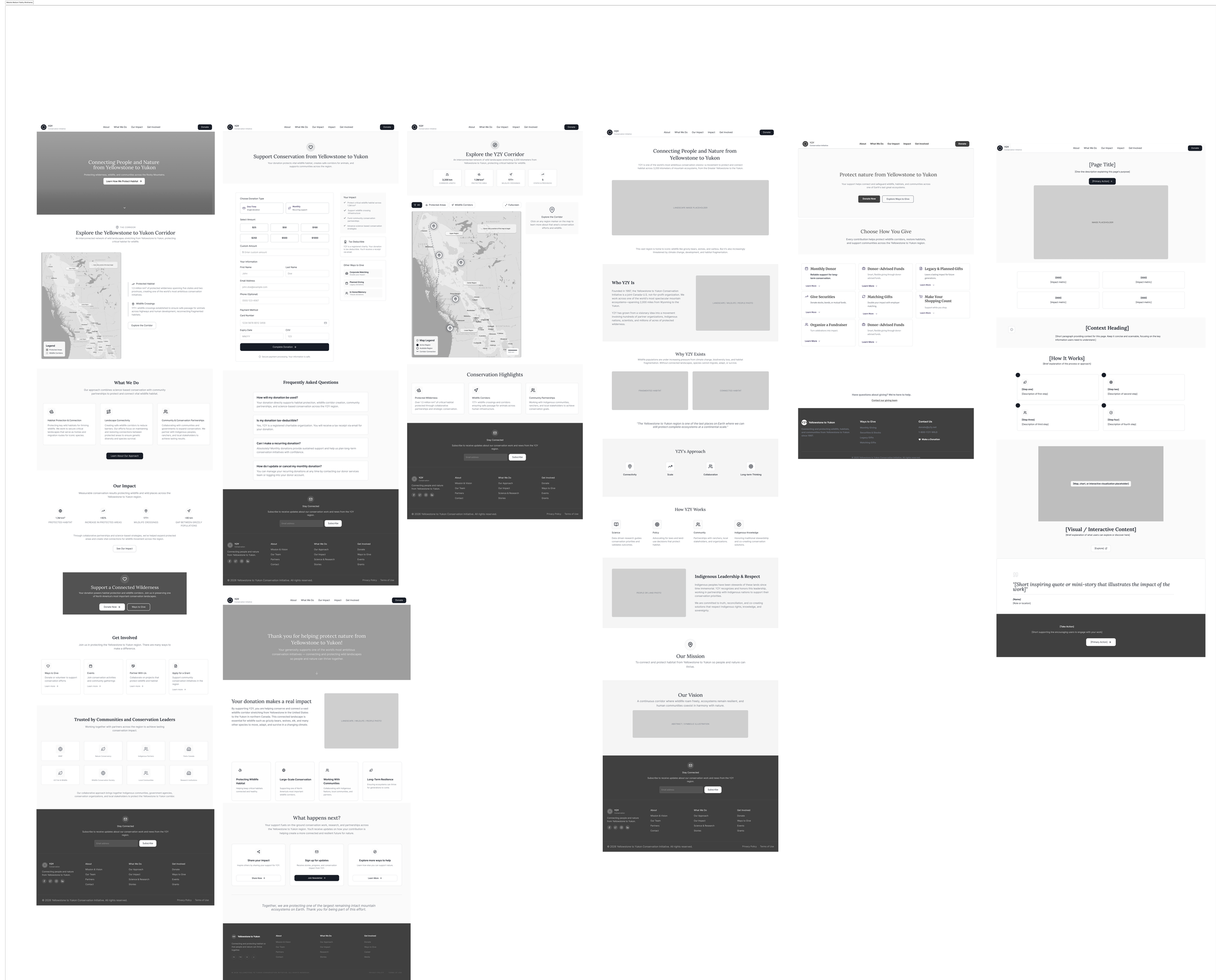
Information Architecture Testing
I created three IA variations and tested them with users:
Test 1: Hierarchical Hub Structure (failed)
Single donation page at top level, all content flowing into it
Users felt pressured and bounced immediately
Donation rate: 14%
Test 2: Content-First with Integrated Calls-to-Action (succeeded)
Organized primary sections by user intent: Discover, Learn, Support
Integrated donation entry points throughout, not isolated at the end
Clear visual hierarchy showing content relationships
Donation rate: 58%
Test 3: Final Refined Structure (best performance)
Added a dedicated "Ways to Support" hub that consolidated donation options, volunteering, and partnerships
Created breadcrumb-style navigation showing users where they were and how to return to key pages
Reduced homepage clutter by 40%, surfacing only essential navigation
Donation rate: 68%
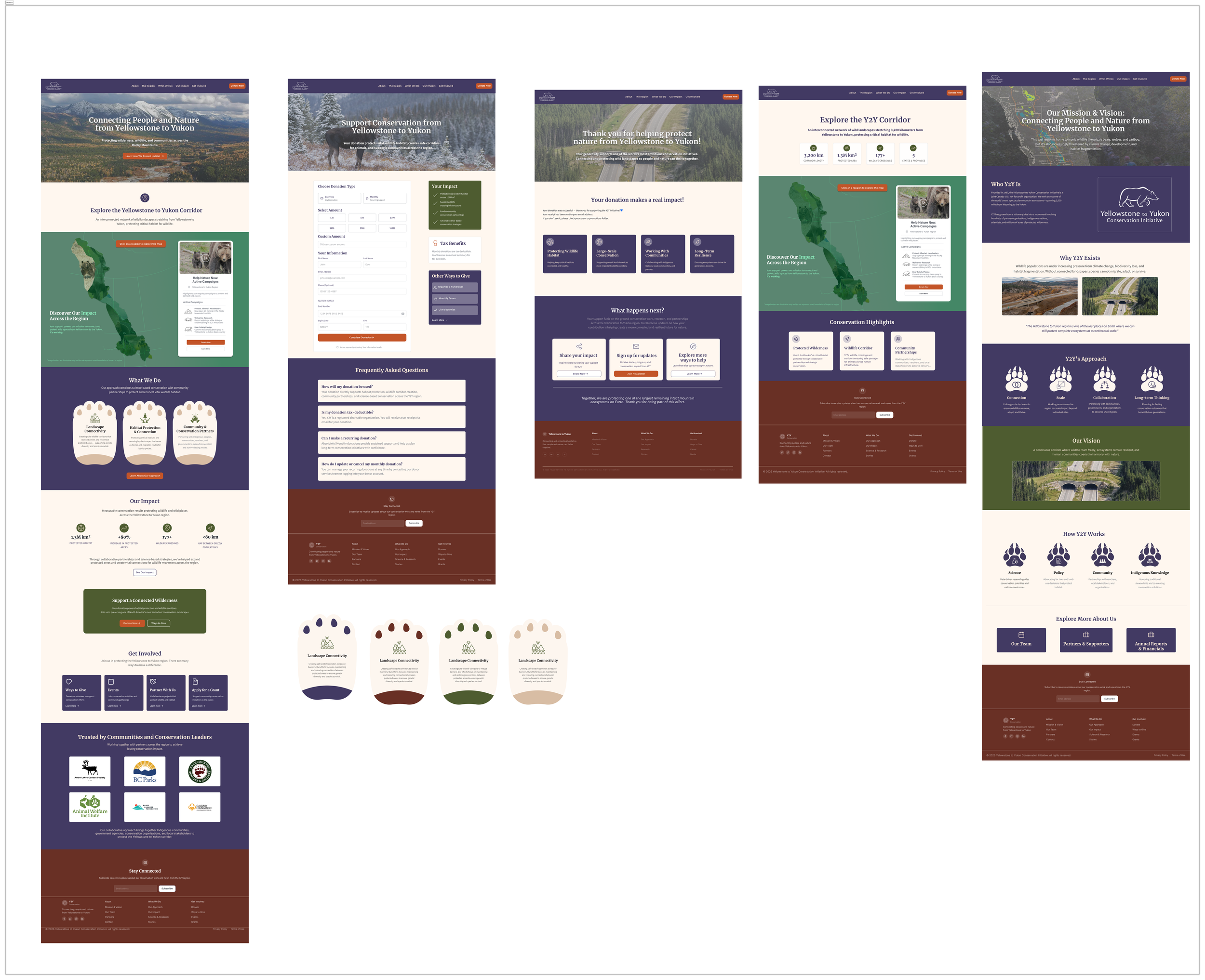
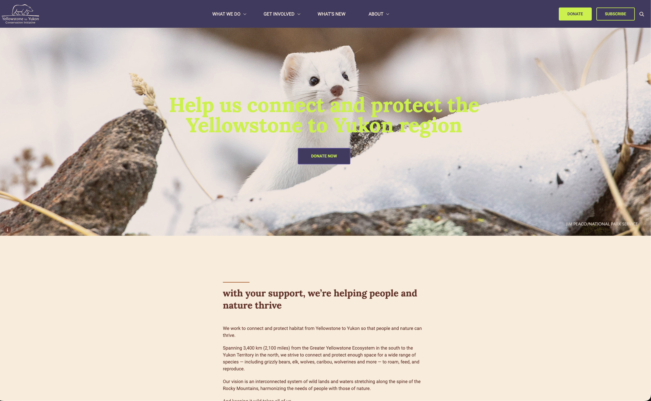
Solution & Design Decisions
-
We reorganized the site around user intent:
Discover - Mission, impact, and region-specific content (entry point for new visitors)
Learn - Educational resources, research, and deep dives (supports educators and advocates)
Support - Donations, partnerships, and volunteer opportunities (clear conversion paths)
Each bucket had consistent visual language and clear internal navigation, eliminating confusion about content relationships.
Flattened Navigation Depth
Key pages moved from 4-7 clicks to 2-3 clicks maximum:
Homepage to donation pages: reduced from 7 clicks to 2 clicks
Homepage to region-specific content: reduced from 6 clicks to 2 clicks
Any page to donation options: reduced from 5 clicks to 1-2 clicks
Integrated Donation Pathways
Rather than isolating donation pages at the end of a linear journey, I created multiple entry points throughout the site:
Content-specific donation options (donate to support a specific region)
Mission-based support (donate to the overall conservation work)
Ways to Support hub consolidating all contribution options
This reduced decision friction and gave users control over how they engaged.
Visual Hierarchy & Progressive Disclosure
I redesigned the homepage and key landing pages to use progressive disclosure:
Primary navigation showed only essential options (3-4 items)
Secondary navigation revealed contextual options based on user location
Call-to-action buttons were consistent across all pages, but contextual to content
Breadcrumb Navigation & Wayfinding
Added breadcrumb-style navigation showing users where they were in the site and how to return to key hubs. This reduced the feeling of being lost and made it easier to explore without fear of getting stuck.


-
Navigation Efficiency
Average clicks to reach donation page: reduced from 7 to 2
Homepage bounce rate: dropped from 44% to 28%
Pages per session: increased from 2.1 to 3.8
Time on site: increased from 1m 45s to 4m 22s
Conversion Impact
Users reaching donation pages: increased from 36% to 89%
Actual donation rate: increased from 12% to 68%
Repeat visitors who engaged with content before donating: increased from 18% to 52%
Content Discoverability
Educators finding curriculum resources: increased from 8% to 67% (first visit)
Users exploring multiple regions: increased from 14% to 49%
Educational content engagement time: increased from 2 minutes to 7 minutes
Site-Wide Health
Overall site engagement increased 34%
Exit rate from key content pages dropped from 38% to 12%
Users completing multi-step engagement paths: increased from 9% to 41%
Key Takeaway
Clear information architecture isn't just about organization, it's about reducing friction toward your mission. By restructuring the site around user intent rather than content silos, and creating multiple entry points to core actions, the organization transformed visitors into supporters without overwhelming or pressuring them.