From Confused to Converted, The Glasnot Shop Redesign
When they get it, they want it.
Thoughtfully crafted to elevate
what matters most.
UX/UI Redesign Case Study
Role: UX/UI Designer | Methods: Heuristic Eval, User interviews, Usablility Testing
-
The Problem
The homepage dropped visitors straight into a product grid. No brand story. No explanation of how ordering works. Most items are made to order with a 4–6 week wait, but nothing on the site made that clear upfront. Users were confused before they even got to checkout.
-
Process
A heuristic eval revealed three issues: no category structure in the nav, no ordering context before the browse, and production timelines appearing too late in the flow. The redesign added clear category splits, moved the "how ordering works" explanation to the hero, and surfaced the wait time at the cart, not after purchase.
-
Key Decision
The original site buried "made to order" in fine print. The redesign led with it. Every product card got a badge. The homepage got a dedicated module. The goal wasn't just better conversion, it was fewer confused customers after the fact.
-
1. Critical ordering info is buried in a marquee banner (Visibility of System Status) The 4-6 week production wait and the "email us if it shows sold out" policy are tucked into a scrolling announcement bar at the very top, easy to miss and gone before you've even looked at a product. For a shop where almost everything is made to order, that's the single most important thing a user needs to know, and it's treated like a promotional footnote.
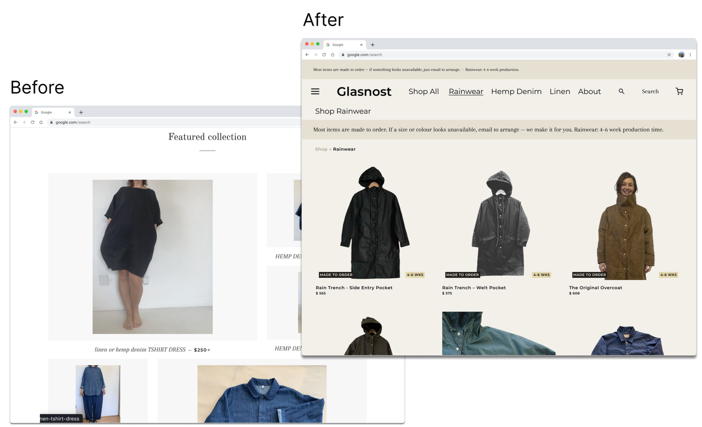
2. No navigation categories (Match Between System and Real World) The only nav option is "Shop," which dumps you into a single flat grid mixing rainwear, linen, hemp denim, accessories, and sold-out items all together. Users browsing for a specific type of piece have no way to orient themselves. Scanning 30+ products without any structure puts the work on the user instead of the site.
3. Product names don't communicate what the items are (Recognition Over Recall) Titles like "linen or hemp denim TOPS," "linen or hemp denim BOTTOMS," and "linen PALAZZO JUMP" rely on the user to already understand the product range. Combined with small thumbnail images and no category context, someone new to the brand has to work hard just to figure out what they're looking at before they can decide if they want it.
-
"I didn't realize I had to email them. I thought it was just sold out."
"I wasn't sure if this was a raincoat store or a clothing store, there's just... everything on one page."
"I found the coat I wanted but I have no idea how long it's going to take to actually get it."
-
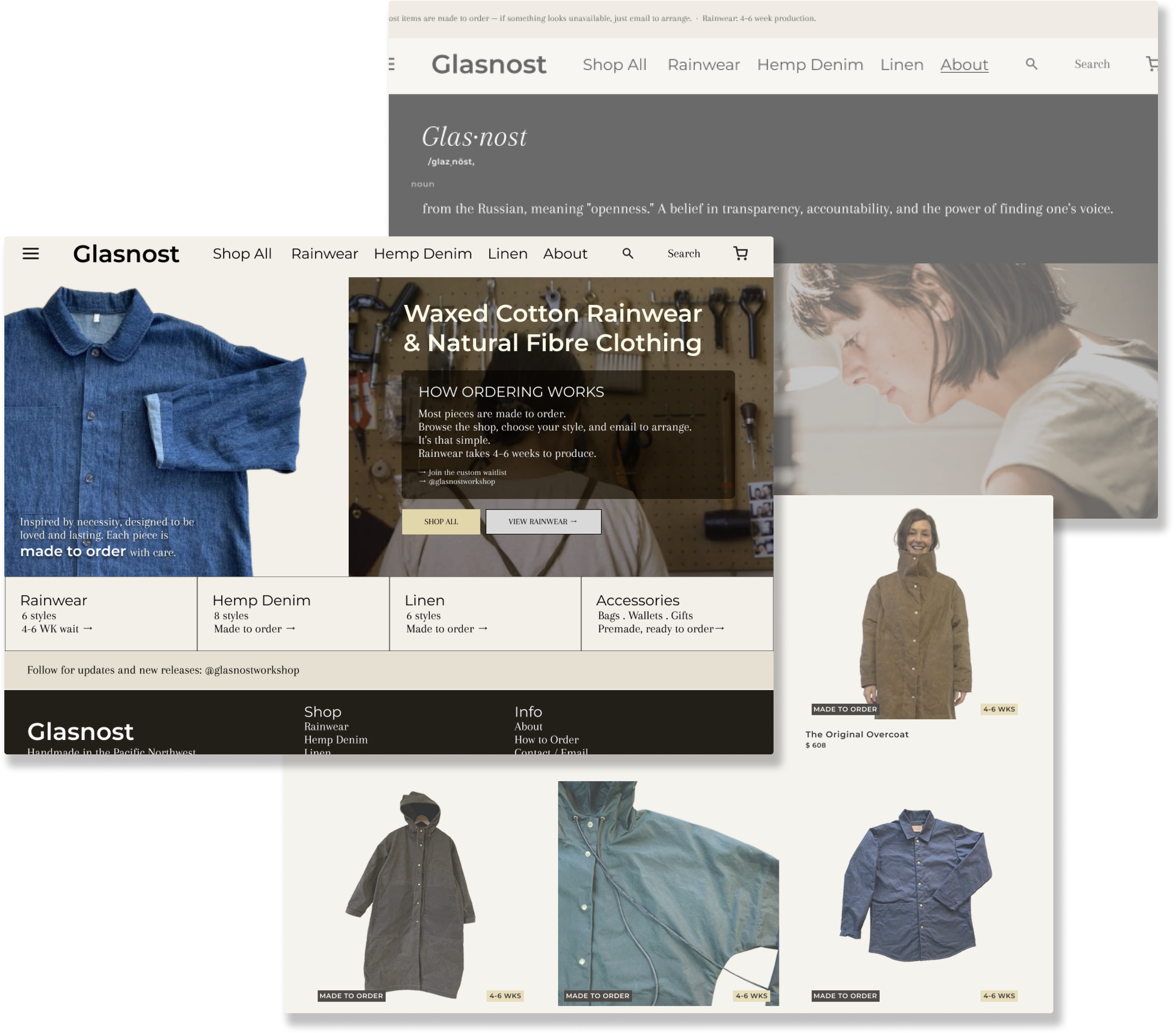
Homepage - Hero establishes brand + "how ordering works" module explains the 4-6 week wait upfront.
Shop - Category nav (Rainwear, Linen, Hemp Denim). Every made-to-order card is badged.
Product Page - Timeline stated near the price. Unavailable items show "Request This Item" instead of sold out.
Cart - Single-line reminder: "Allow 4-6 weeks for rainwear production."
Checkout - Standard. Order confirmation email restates timeline.
Glasnost makes handcrafted waxed cotton rainwear out of Vancouver. The clothes are exceptional, but the website was confusing to it's users.
Glasnot Shop Redesign
The Shopping Gallery
The original Glasnost shop was a single flat grid.
Every product dumped onto one page with no separation between rainwear, linen, and hemp denim.
The redesign broke the shop into clear categories, so users could land on what they were actually looking for through consistent product card formatting, making the browse feel intentional rather than like a stockroom.
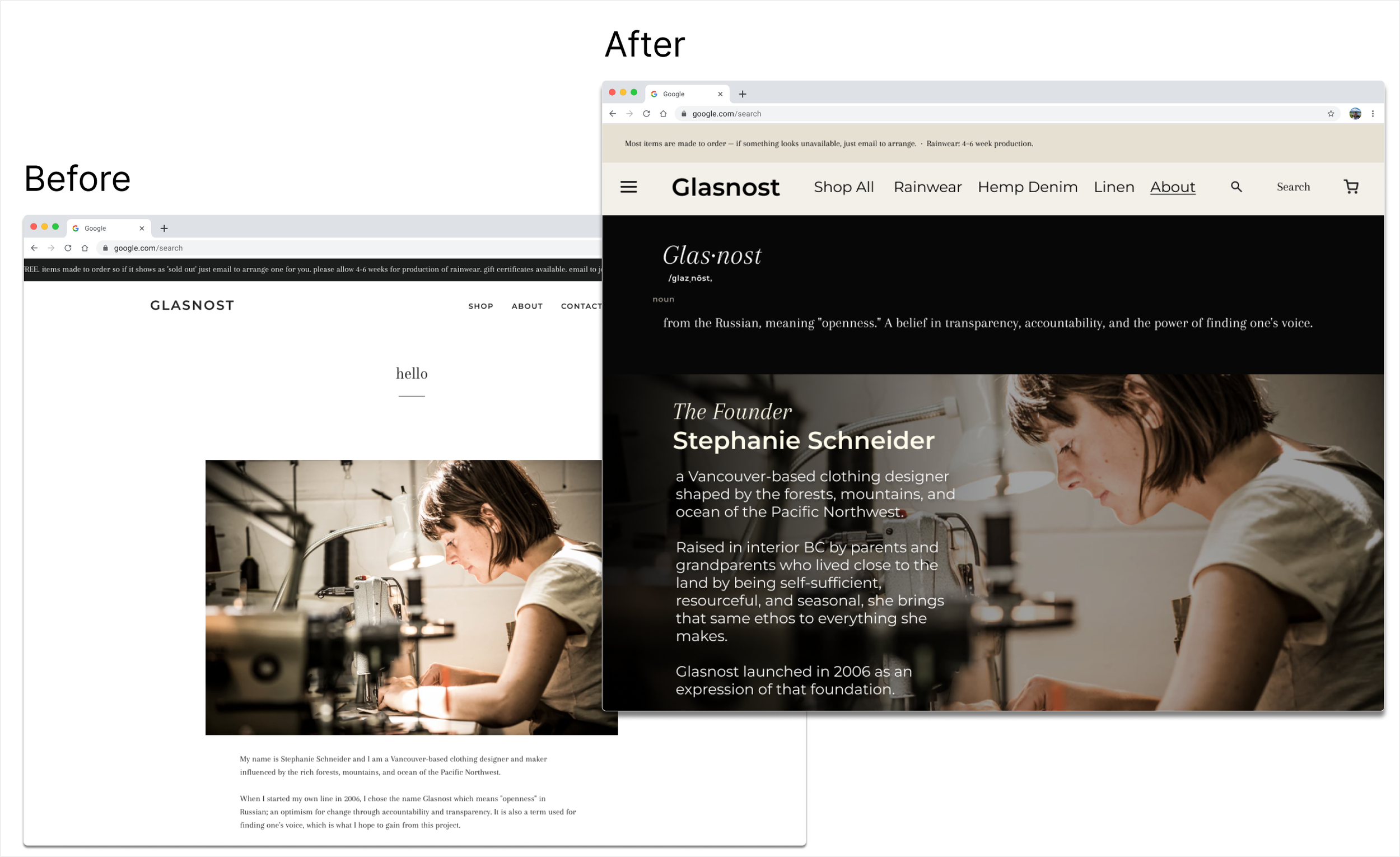
In the about page we focus more on the ethos and creator of the brand and the handmade nature of the work.
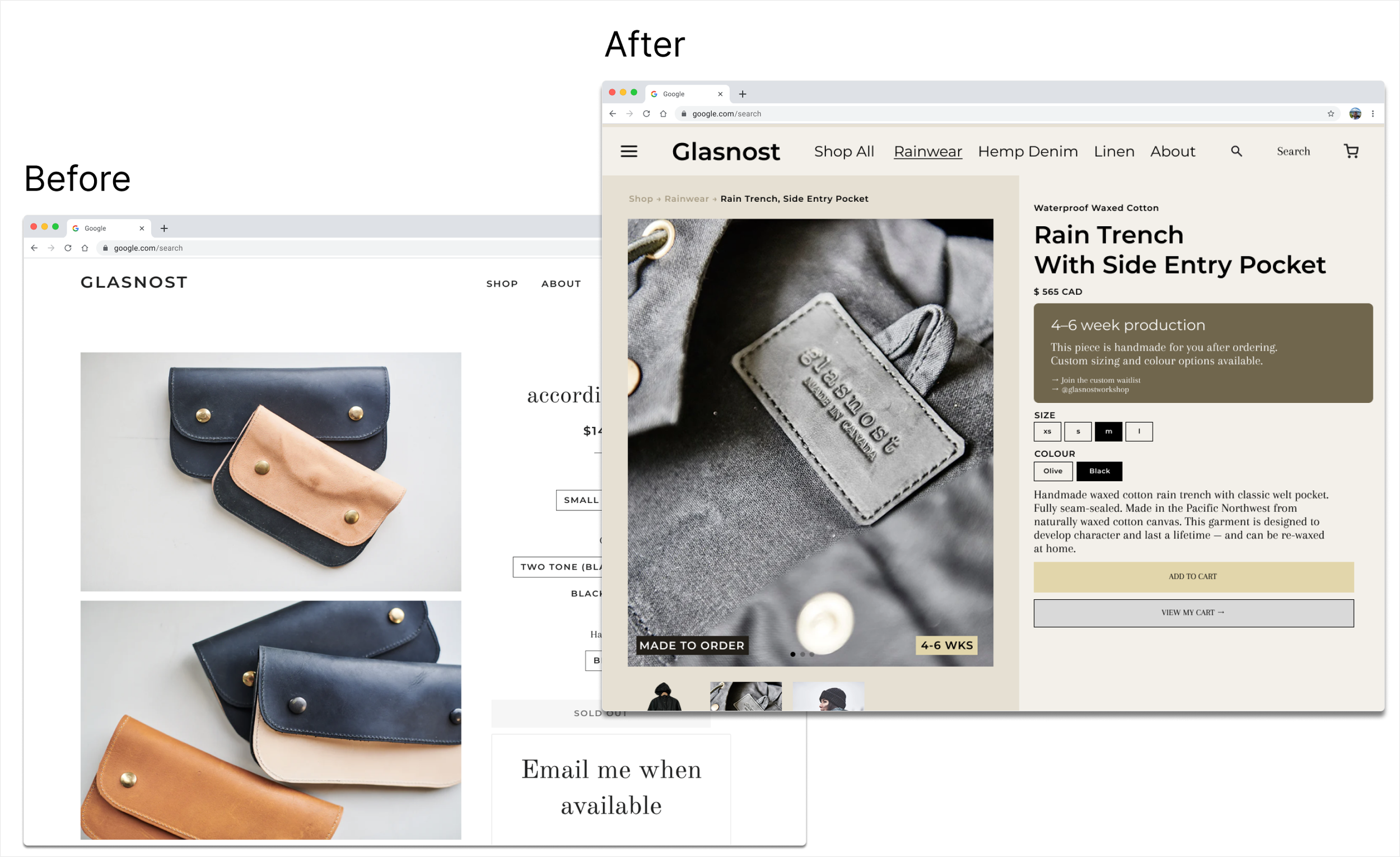
In the item page we focus more on the clarity of custom orders and timelines for made to order items, as well as an add to cart button instead of an email field.
Key Takeaways
The Glasnot redesign came down to one fix: tell people how ordering works before they get lost in the products. Moving the "made to order" policy to the hero, adding category structure to the shop, and surfacing wait times earlier in the flow all reduced confusion at the source. Fewer support emails and a big drop in cart abandonment confirmed it worked.